Seven Ways You Can Place Elements Using CSS Grid Layout


This article was updated on 23rd March, 2017. Specifically: browser support for CSS Grid Layout.
In this article, we are going to learn seven ways in which you can place elements in a web page using the Grid Layout module.
Previously, SitePoint published Introducing the CSS Grid Layout. Recently, I also wrote Where Things Are at in the CSS Grid Layout Working Draft.
Here, the focus will be entirely on specific ways in which you can lay out elements on the web using CSS Grid. Now, let’s go over each one of them.
Addressing Browser Support for Grid Layout
At this time, Grid Layout doesn’t yet have consistent browser support. However, as of March 2017, both latest versions of Chrome and Firefox browsers have been released with CSS Grid Layout support by default. IE still supports the old implementation, Opera needs the Experimental Web Platform flag turned on, and Safari has no support at all. To properly work with all the examples in this article, I suggest you use either Chrome or Firefox. For readers who for some reason find it problematic to use these browsers, I have added a screenshot to show the final result of each technique.
#1 Specifying Everything in Individual Properties
This is the version we have been using to place the elements in our previous articles. This method is verbose but easy to understand. Basically, the left/right and top/bottom bounds of an element are specified using grid-column-start/grid-column-end and grid-row-start/grid-row-end properties. If an element is only going to span one row or column, you can omit the -end properties, this way you will have to write a little less CSS.
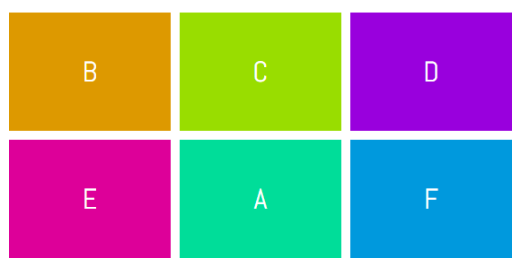
In the demo below, element A has been placed in the second row and second column using the following CSS:
.a {
  grid-column-start: 2;
  grid-column-end: 3;
  grid-row-start: 2;
  grid-row-end: 3;
}
The same effect could be achieved by using:
.a {
  grid-column-start: 2;
  grid-row-start: 2;
}
See the Pen Specifying Everything in individual Properties by SitePoint (@SitePoint) on CodePen.
#2 Using grid-row and grid-column
Even though the CSS in our first example was readable and easy to understand, we had to use four different properties to place a single element. Instead of using four properties, we can just use two — grid-column and grid-row. Both these properties will take two values separated by a slash where the first value will determine the start line and the second value will determine the end line of our element.
Here is the syntax you need to use with these properties:
.selector {
grid-row: row-start / row-end;
grid-column: col-start / col-end;
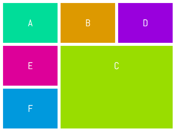
}To place item C in the bottom right corner of our grid, we can use the following CSS:
.c {
  grid-row: 2 / 4;
  grid-column: 2 / 4;
}
See the Pen Using grid-row and grid-column by SitePoint (@SitePoint) on CodePen.
#3 Using grid-area
Technically, the item we are laying out covers a specific area of the webpage. The boundary of that item is determined by the values we provide for the grid lines. All of these values can be supplied at once using the grid-area property.
This is what your CSS would look like when using this property:
.selector {
  grid-area: row-start / col-start / row-end / col-end;
}
If you have trouble remembering the correct order of these values, just keep in mind that first you have to specify the position of the top-left ( row-start – col-start ) corner and then the bottom-right ( row-end – col-end ) corner of your element.
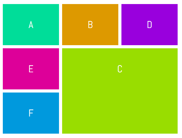
Just like the previous example, to place item C in the bottom right corner of our grid, we can use the following CSS:
.c {
  grid-area: 2 / 2 / 4 / 4;
}
See the Pen Using grid-area by SitePoint (@SitePoint) on CodePen.
#4 Using the span Keyword
Instead of specifying the end line while laying out elements, you can also use the span keyword to set the number of columns or rows a particular element will span.
This is the proper syntax when using the span keyword:
.selector {
  grid-row: row-start / span row-span-value;
  grid-column: col-start / span col-span-value;
}
If your element spans across only one row or column you can omit both the span keyword and its value.
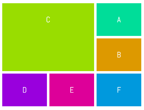
This time let’s place item C in the top left corner of our grid. We can use the following CSS to do so.
.c {
  grid-row: 1 / span 2;
  grid-column: 1 / span 2;
}
See the Pen Using span with grid lines by SitePoint (@SitePoint) on CodePen.
#5 Using Named Lines
Until now, we have been using raw numbers to specify grid lines and it is easy to use when we are working with simple layouts. However, when you have to place several elements, it can get a bit confusing. Most of the times, an element on your page will fall under a specific category. For example, the header may go from column line c1 to column line c2 and from row line r1 to row line r2. It would be a lot easier to properly name all the lines and then place your elements using these names instead of numbers.
Let’s create a very basic layout to make the concept clearer. First, we will have to modify the CSS applied to our grid container:
.container {
display: grid;
grid-gap: 10px;
grid-template-columns: [head-col-start] 180px [content-col-start] 180px [content-col-mid] 180px [head-col-end];
grid-template-rows: [head-row-start] auto [head-row-end] auto [content-row-end] auto [footer-row-end];
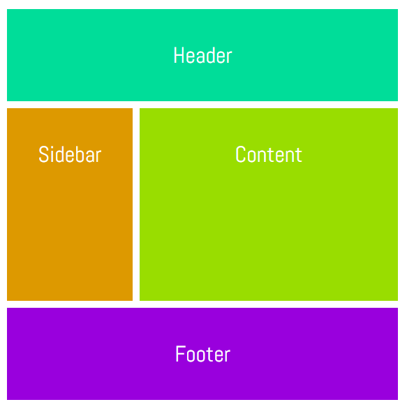
}What I have done above is assign names to all the lines based on the type of content that they will enclose. The idea here is to use names that provide us with some insight into the placement of different elements. In this particular example, our header element spans across all the columns. Therefore, assigning the name “head-col-start” and “head-col-end” to the first and last column line respectively will make it clear that these lines represent the left and right end of our header. All other lines can be named in a similar fashion. After all the lines have been named, we can use the following CSS to place all our elements.
.header {
  grid-column: head-col-start / head-col-end;
  grid-row: head-row-start / head-row-end;
}

.sidebar {
  grid-column: head-col-start / content-col-start;
  grid-row: head-row-end / content-row-end;
}

.content {
  grid-column: content-col-start / head-col-end;
  grid-row: head-row-end / content-row-end;
}

.footer {
  grid-column: head-col-start / head-col-end;
  grid-row: content-row-end / footer-row-end;
}
Although we had to write more CSS than usual, now just looking at the CSS will give us an idea of where an element is located.
See the Pen Using Named Lines by SitePoint (@SitePoint) on CodePen.
#6 Using Named Lines with a Common Name and the span Keyword
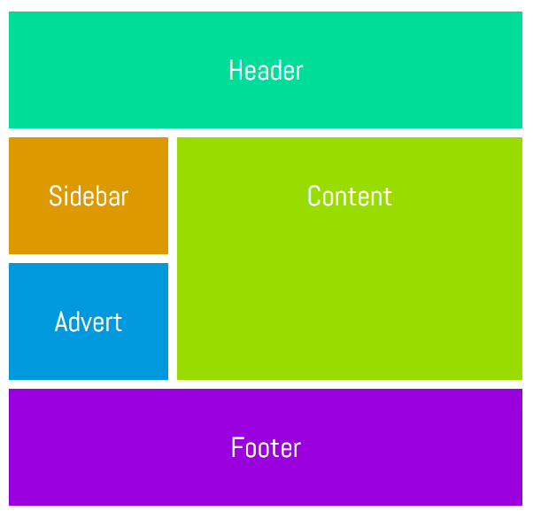
In the previous method, all lines had different names marking the starting, midpoint or the end of an element. For example, “content-col-start” and “content-col-mid” marked the starting and mid point of the content section of our webpage. If the content section covered a few more rows, we would have to come up with additional line names like “content-col-mid-one”, “content-col-mid-two” and so on.
In situations like these, we can just use a common name like “content” for all grid lines of our content section and then use the span keyword to specify how many of those lines an element spans. We can also just mention a number along with the line name to set the number of rows or columns an element would span.
Using this method, the CSS would look like this:
.selector {
  grid-row: row-name row-start-number/ row-name row-end-number;
  grid-column: col-name col-start-number / span col-name col-to-span;
}
Like the last method, this one also requires you to modify the CSS of your grid container.
.container {
  display: grid;
  grid-gap: 10px;
  grid-template-columns: [one-eighty] 180px [one-eighty] 180px [one-eighty] 180px;
  grid-template-rows: [head-row] auto [content-row] auto [content-row] auto [content-row] auto [footer-row] auto;
}
Each of the named column lines has the same name representing their width in pixels and each named row line represents the rows covered by a specific section of the webpage. In this demo, I have introduced an advertisement section just under the sidebar. Here is the CSS:
.header {
  grid-column: one-eighty 1 / one-eighty 4;
  grid-row: head-row / content-row 1;
}

.sidebar {
  grid-column: one-eighty 1 / one-eighty 2;
  grid-row: content-row 1 / content-row 2;
}

.advert {
  grid-column: one-eighty 1 / one-eighty 2;
  grid-row: content-row 2 / content-row 3;
}

.content {
  grid-column: one-eighty 2 / one-eighty 4;
  grid-row: content-row 1 / span content-row 2;
}

.footer {
  grid-column: one-eighty 1 / span one-eighty 3;
  grid-row: content-row 3 / footer-row;
}
See the Pen Using Named Lines with Span by SitePoint (@SitePoint) on CodePen.
#7 Using Named Grid Areas
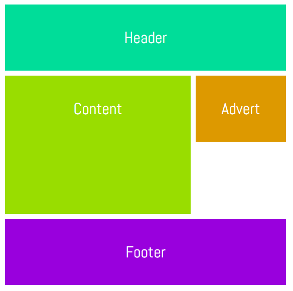
Instead of using lines, we can also place elements by assigning names to different areas. Again, we will have to make some changes to the CSS of our grid container.
The CSS for our container should now look like this:
.wrapper {
  display: grid;
  grid-gap: 10px;
  grid-template-columns: 180px  180px  180px;
  grid-template-areas:  "header  header   header"
                        "content content  advert"
                        "content content  ......"
                        "footer  footer   footer";
}
A single dot (.) or a sequence of dots will create an empty cell with nothing in it. All the strings need to have the same number of columns. That’s why we had to add the dots instead of leaving it completely blank. For now, the named grid area can only be rectangular. However, this may change in future versions of the spec. Let’s take a look at the CSS of all our elements.
.header {
  grid-area: header;
}

.content {
  grid-area: content;
}

.advert {
  grid-area: advert;
}

.footer {
  grid-area: footer;
}
Once you have defined all the grid areas, assigning them to various elements is pretty straightforward. Keep in mind that you can’t use any special characters while assigning names to areas. Doing so will make the declaration invalid.
See the Pen Using Named Grid Areas by SitePoint (@SitePoint) on CodePen.
Conclusion
That’s it! We have covered seven different methods of laying out elements using the CSS grid layout. Is there any tip that you would like to share with other readers regarding this article? Which of these methods would you prefer to use in your own projects? Let us know in the comments.